


Angular Material Theme Switcher: Part 1
A step-by-step guide to Angular Material's Sass-based theming: define your own color palettes and typography, then add a runtime light and dark mode toggle built on the same engine.
Angular Material is the Material Design component library built for Angular developers by the Angular team. It offers many of the most commonly used form control, layout, and navigation components you need for developing a successful application and more. One of the ways you can use Angular Material to set your application apart is by using their custom theming engine to give it a unique look and feel. In this article, you’ll learn how to create a couple of basic Material themes, as well as a slide-toggle to switch back and forth between those themes.
Let’s get started
ng add @angular/material
app.module.ts
@NgModule({
 declarations: [AppComponent],
 imports: [
  BrowserModule,
  BrowserAnimationsModule,
  MatButtonModule,
  MatFormFieldModule,
  MatIconModule,
  MatInputModule,
  MatSlideToggleModule,
  ReactiveFormsModule
 ],
 providers: [],
 bootstrap: [AppComponent]
})
export class AppModule {}
In your app.module.ts, you’ll want to import the button, form-field, icon, input, and slide-toggle modules from @angular/material as well as the Angular BrowserAnimationsModule and ReactiveFormsModule.
Now we can start creating our component. Because this is such a simple application, we’re just going to replace the @angular/cli generated app.component code with our own.
First, replace your src/styles.scss with this:
src/styles.scss - part I
/* You can add global styles to this file, and also import other style files */

html,
body {
 height: 100%;
}
body {
 margin: 0;
 font-family: Roboto, "Helvetica Neue", sans-serif;
}
Here’s the template (app.component.html):
src/app/app.component.html
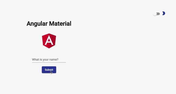
<div align="right">
 <mat-slide-toggle [formControl]="toggleTheme">
  <mat-icon color="primary">
   brightness_2
  </mat-icon>
 </mat-slide-toggle>
</div>

<div style="text-align:center">
 <h1>
  Angular Material
 </h1>
 <img
   width="100"
   alt="Angular Logo"
   src="..."
 />

 <br />
 <br />

 <ng-container *ngIf="!submitted; else greet">
  <mat-form-field>
   <input
       matInput
       placeholder="What is your name?"
       [formControl]="userName"
       (keydown.enter)="submit()"
   />
  </mat-form-field>
  <br />
  <button mat-raised-button color="primary" (click)="submit()">Submit</button>
 </ng-container>
 <ng-template #greet>
  <h3>Hello, {{ userName.value }}!</h3>
  <button mat-raised-button color="accent" (click)="clear()">Clear</button>
 </ng-template>
</div>
Some super-minimal styles (app.component.scss):
src/app/app.component.scss
:host {
 display: block;
 padding: 100px;
}
And our typescript component (app.component.ts):
src/app/app.component.ts - part I
import { Component } from '@angular/core';
import { FormControl } from '@angular/forms';

@Component({
 selector: 'app-root',
 templateUrl: 'app.component.html',
 styleUrls: ['app.component.scss']
})
export class AppComponent {
 userName = new FormControl('');
 submitted = false;

 clear() {
  this.userName.reset();
  this.submitted = false;
 }

 submit() {
  this.submitted = true;
 }
}
Now, if you run ng serve right now, you will see some things, unstyled things. A single input with the placeholder “What is your name?”, a Submit button, and a check-box in the top right corner. If you try out the input and hit submit, you’ll see a greeting.
It’s a fine little input, but what you’re really here for is that check-box in the top right corner. But let’s back up a bit.
Back in the app/material directory, go ahead and create a _**theme.scss **file.
First, we’re going to import the Angular Material theming Sass file: @import "~@angular/material/theming"; this gives us a bunch of useful classes, functions, mixins, and variables for theming.
To style the Angular Material components we also want to add @include mat-core();.
Next, we’re going to create some variables for our theme:
src/app/material/_theme.scss - part I
@import "~@angular/material/theming";
@include mat-core();

$light-theme-primary: mat-palette($mat-indigo, 700, 300, 900);
$light-theme-accent: mat-palette($mat-light-blue);
$light-theme-warn: mat-palette($mat-deep-orange, A200);
Passing these variables into the Material Sass function, mat-light-theme, we’ll create our first theme:
src/app/material/_theme.scss - part II
$light-theme: mat-light-theme(
 $light-theme-primary,
 $light-theme-accent,
 $light-theme-warn
);
For us to use this new theme, we need to do a few things:
- add the theme to a class
- import our _theme.scss into our styles.scss
- add the new class to the body tag in the index.html
For consistency, let’s call it light-theme. This new light-theme includes our theme passed into the angular-material-theme function:
src/app/material/_theme.scss - part III
.light-theme {
 @include angular-material-theme($light-theme);
}
Import the _theme.scss in src/styles.scss:
src/styles.scss - part II
/* You can add global styles to this file, and also import other style files */
@import "./app/material/theme";

html,
body {
 height: 100%;
}
body {
 margin: 0;
 font-family: Roboto, "Helvetica Neue", sans-serif;
}
Add light-theme and mat-app-background to <body> (src/index.html):
src/index.html - part I
<body class="light-theme mat-app-background">
 <app-root></app-root>
</body>
Go ahead and throw these links in the <head> too:
src/index.html - part II
<link
 href="https://fonts.googleapis.com/css?family=Roboto:300,400,500&display=swap"
 rel="stylesheet"
/>
<link
 href="https://fonts.googleapis.com/icon?family=Material+Icons"
 rel="stylesheet"
/>
At this point, if you check in on the served application, you’ll see the light theme in action. We also have a little moon icon and a (semi)working slide-toggle! But for that slide-toggle to do anything, we need to wire it up to some functionality. In the app.component template, we used the formControl attribute to assign the name toggleTheme. In the app.component.ts, we’ll create the toggleTheme property and define it as a FormControl:
toggleTheme = new FormControl(false);
The false value passed into the FormControl constructor is the default value. Since we’re using the ReactiveFormsModule, we can subscribe to valueChanges on the toggleTheme control:
src/app/app.component.ts - part II
ngOnInit() {
 this.toggleTheme.valueChanges.subscribe(toggleValue => {
  if (toggleValue === true) {
   this._renderer.addClass(document.body, 'dark-theme');
   this._renderer.removeClass(document.body, 'light-theme');
  } else {
   this._renderer.addClass(document.body, 'light-theme');
   this._renderer.removeClass(document.body, 'dark-theme');
  }
 });
}
With this very basic logic, our slide-toggle switches the class on the <body> tag from light-theme to dark-theme. Check it out in the dev tools Elements tab if you’d like; now, let’s create our dark theme.
Back in the _theme.scss file, you’re going to add four new variables: $dark-primary, $dark-accent, $dark-warn, and $dark-theme:
src/app/material/_theme.scss - part IV
$dark-theme-primary: mat-palette($mat-blue-grey);
$dark-theme-accent: mat-palette($mat-amber, A200, A100, A400);
$dark-theme-warn: mat-palette($mat-deep-orange);

$dark-theme: mat-dark-theme(
 $dark-theme-primary,
 $dark-theme-accent,
 $dark-theme-warn
);
Just like the light-theme, we’re going to use the .dark-theme class selector to call the angular-material-theme function:
src/app/material/_theme.scss - part V
.dark-theme {
 @include angular-material-theme($dark-theme);
}
To recap, we’ve covered how to:
- Add Angular Material Modules to your application by adding them to the AppModule’s
importsarray - Build custom Material themes
- Set the default theme of your application in the index.html
- Implement a “switcher” to toggle between your custom themes
One more thing: If you’re running the demo app, have you tried refreshing the page? If you have, you may have noticed that the application doesn’t remember which theme you’ve selected and reverts to the default theme. In a future article, I’ll go over a few of the different ways you can save or persist the user’s theme preference. Thanks for reading!
To see the code and run the demo, check out the Github repo.
For more info on Angular Material, check out material.angular.io.
For help choosing theme colors, check out the official material palette generator.
Author: Anthony Jones, Sr. Enterprise Software Engineer